Hihat is a mobile app that helps those who have food allergies find restaurants, cafes, and other eating locations that will cater to or accommodate their specific diets and needs. Users will be able to find places that they can confidently go and eat with the validation from community reviews, being able to see the menu, and viewing other specific details about restaurants on one platform.
Final Prototype
Finding restaurants and other dining locations is a market that is dominated by products that help the population look for and review these places. The possibilities seem limitless unless you are someone who has food allergies and has specific dietary requirements. Over 15 million Americans have food allergies, with 1 out of every 3 kids who have a food allergy. Anyone can be allergic to any food, but the most common allergies are from Milk/Dairy, Eggs, Peanuts, Tree Nuts, Soy, Wheat/Gluten, Fish, and Shellfish. These are extremely common foods in the day to day life which can make it difficult to go out and find locations that are accommodating to those who have food allergies.
I created a survey using Google Forms and sent it out to try and gauge the variety of thought on going to restaurants with food allergies. Since this is a subject matter that is very niche, the type of answers I had to receive needed to come from a specific group. I spread it out among my peers, but I also reached out to forums on Reddit to see if I could get some interaction within the food allergy community. I was able to have a few conversations through this platform which gave me a better comprehension of experience depending on what food allergy the person may have and the severity of their allergy as well.
Through those online conversations and the survey results, I was able to validate what direction I should go in and figure out how to create an environment that is trustworthy and transparent for the food allergy community.

Eat out once a week
2-4 times during a week

Own iPhones
Own Android devices

18 - 24-years-olds
25 - 34-years-olds
35 - 44-years-old
The popular online methods include online blogs, reviews from Google, Yelp, Tripadvisor.
Word of Mouth is by the most popular though.
Validating whether a restaurant is a possible place to explore, participants will review the restaurants website to review the menu and gain any other information that can find.
A main concern that participants have when going to a restaurant is cross-contamination and having any options to choose from at all.
Overall, participants want to be informed and aware of what is going to be in their food. The more information and reassurance they have allows their experience to be a lot more comfortable.
When it comes to searching for locations to dine and experience, the most significant competitors in this space are Google Reviews, Yelp, and FourSquare. Each of these companies has the technological infrastructure and have built communities of reviewers within their platforms to help validate their restaurants. When looking for more niche audiences, there are platforms like AllergyEats and Spokin which cater specifically to people who have food allergies, but may not have the networks like the mentioned giants.
When we look closer at these competitors, companies like Yelp, Google Reviews, and FourSquare cater to such large audiences. They cannot focus on the specific needs people with food allergies have. AllergyEats has the most similar goals/direction with Hihat, but improvement in the usability and UI of their application is something that Hihat aims to bring about on its platform.


From the researched and the created personas, I began to build the structure of the app by establishing the user stories. I then focused on in on the flows that would allow the user to be able to do the most basic yet crucial tasks for them to be able to use the app and keeping their needs in mind too.
I began with sketches and then moved to Figma to create lo-fidelity wireframes. I built out those flows, using a simple/grayscale internal UI kit.
Lo-fidelity Wireframes
Yes, the hi-hat you hear on a traditional 4-on the floor rock and roll beat. It’s fun, yet repetitive tap that you catch when listening to your favorite song. Like the hi-hats you hear in songs, Hihat is a brand that aims to build a consistent and trustworthy platform for users who want to find food allergy friendly places around them. We know the seriousness of food allergies, but we don’t want to take away the enjoyment and experiences that food can bring. At Hihat we keep it upbeat and only want to be a fun groove in people’s lives.

I wanted to explore a name that doesn’t necessarily have the word “allergy” in it or friendly or anything along those lines. I understand that names should explain things, but I wanted to go in a more abstract direction considering the name of companies like Allergy Eats. I use to play the drums and thought of hi-hats because they are a set of light/fun cymbals, but consistent which is what I wanted to evoke. Food allergies are a serious matter, but the experience conveyed doesn’t have to highlight fear and trepidation.


The primary color (and the most used color) throughout the app is the a blue because in color theory blue usually means TRUST. It is however a brighter blue because, based on the direction I took the app. The orange pink/read and green are used sparingly but act as accents throughout to support the blue in the app.
These colors help to support a more playful and fun spirit. I wanted to use lighter and brighter colors because I wanted to steer away from conveying something that could be ominous and dooming.
Aa Bb Cc Dd Ee Ff Gg Hh Ii Jh Kk Ll Mm Nn Oo Pp Qq Rr Ss Tt Uu Vv Ww Xx Yy Zz
Light
Regular
Semibold
Bold
Source Sans Pro is an accessible and clean typeface for digital platforms. Created by Paul D. Hunt, ... "it is a sans serif typeface intended to work well in user interfaces."
I wanted a typeface that would compliment the clean and minimalist feeling for the app. I tried a variety of different typefaces, but because it's a mobile app, I needed a font that would easily read on smaller screens. Source Sans Pro also has a great variety of weights which helps with hierarchy throughout the app.
Hihat follows a light/bright, clean, and minimalist design direction with the primary blue to give it an accent of color throughout. Because of the minimalist direction, the bright blue brings attention to specific areas of the app such as the buttons, menu items, search bar, etc. It lets users know that these are the elements (besides the iconography) that you can press or perform an action within the app.
The reason there is minimal use of colors is that there is going to be a lot of photo use (i.e. search results, restaurant profiles, user uploaded photos) and having too many colors along with the photos, would make it seem like there is too much happening in such a small space.


The secondary colors aren't used as often, but they are used when there is need color differentiation (i.e red and green for error and confirmation as states).
I primarily used Figma as my design and prototyping tool due to its accessibility.
I was able to create a small library of components for the application, and I know there is a lot I to reorganize and adjust. By having this library, I know it gave way to consistency while I built the app (especially when it came to editing specific elements throughout). Each component was easy to take apart and adjust if I needed a foundation for a particular component, but needed to change the details.
Onboarding is not necessarily the first action the user needs to do to be able to use the app because I wanted the entry to barrier to be as minimal as possible. At the beginning of each process though, a user would need to input necessary allergy information. We tried only to include the filter options during the initial search process, but users would completely miss the filter options, which is crucial in catering an individualized experience for the user based on their allergies.

It wasn’t difficult for users to figure out where to write a review. It was, however, more intuitive to see the large button at the bottom right when the user navigated to the “Reviews” tab of the restaurant’s profile.

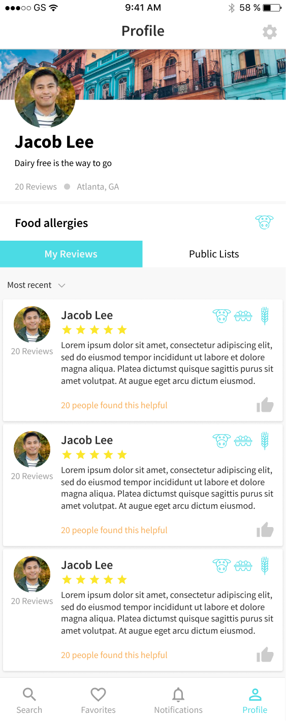
The way the iconography communicated throughout the app is extremely important. When the user saw the icons on the restaurant card, there was a misunderstanding of whether or not those icons meant the user needed to be aware of those allergies versus knowing these the are the allergies the restaurant had the most reviews. The user once realized the correlation when they reviewed the restaurant’s profile.

There are a variety of tools that are extremely helpful for user testing. However, there were technological constraints that can affect the tests. It came to my realization that sitting down with the user to see how they used the app and heard them think out loud gave way to more benefits to understanding a user’s thought process.
Overall, Hihat is an app that explored the viability of applying a specific brand and implementing it through UI and other forms of visual communication such as iconography. The use of the app was intuitive to most users, but throughout this process, I realized interactions that would seem minute would influence how users would experience the app. I also found the flow of a user's initial use of the app, and solving that experience was a great challenge to explore that onboarding isn't always or should be the first thought or action. Interacting with the different groups of people and understanding that this could potentially affect people's lives had me put a lot of views into perspective. I hope to continue to apply a thoughtfulness to the products I contribute in the future and create experiences that users know that the designers behind the "wall" really do care.
Illustrations from undraw.co
Icons from the Noun Project and Google's Material Icons